
Introduction: Are the Samsung Galaxy S25 Ultra Renders a Glimpse Into the Future?
Brace yourself, tech enthusiasts—the Samsung Galaxy S25 Ultra renders have finally emerged and have caused quite a stir. We are getting a sneak peek at what Samsung may have planned for its 2026 flagship based on these new leaks and concept images. Even if renders are often speculative, the reasoning and the excitement are genuine.
These Galaxy S25 Ultra illustrations, featuring a very thin frame, a redesigned camera setup, and perhaps even improved cooling systems, show creativity, ambition, and bold design risks. However, not all fans are pleased; some are concerned that Samsung may be prioritizing form over content.
Let’s analyze all that these amazing renders show and evaluate the enthusiasm—and skepticism—that surrounds the Galaxy S25 Ultra.
Samsung Galaxy S25 Ultra Renders: What’s Changed, What’s New
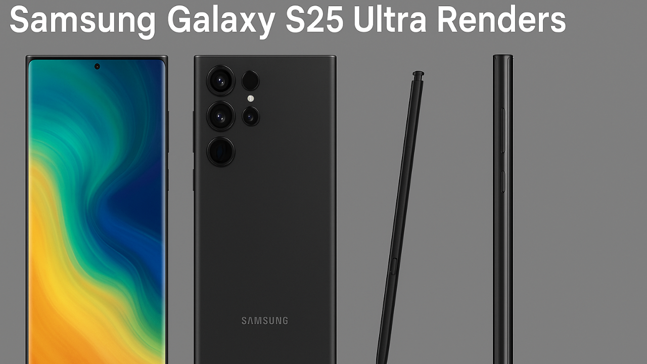
The new Samsung Galaxy S25 Ultra renders have taken the internet by storm, showing a smartphone that feels both familiar and futuristic. Samsung seems to be refining perfection rather than reinventing it, with subtle but meaningful design adjustments.
The frame appears more symmetrical, the bezels thinner, and the rear camera module cleaner, aligning beautifully with Samsung’s premium aesthetic. The device seems to embrace a flatter edge design while maintaining the signature S Pen slot, catering to power users and professionals alike.
These renders hint at improved ergonomics and build quality, possibly with lighter materials or new color finishes. The attention to detail—particularly in the metal frame curvature and camera ring alignment—shows Samsung’s growing design maturity.
Overall, the S25 Ultra looks like a perfect blend of sophistication and strength, teasing an elegant powerhouse built for 2025’s performance demands.
Every new render in the rapidly changing environment of smartphones tells a story, and in this case, the renders of the Samsung Galaxy S25 Ultra depict a transition. Samsung seems to be deliberately leaning toward elegance and straightforwardness, maybe taking influence from years’ worth of consumer feedback.
Substantial design language changes that might differentiate the S25 Ultra from both its predecessors and rivals are hinted at in these renders.
Ultra-Thin Bezels for a Fully Immersive Experience
The most obvious improvement is that there are very few bezels. The front of the Galaxy S25 Ultra is nearly a full screen, making the most of the available room without making the device larger. With its smooth transition between edges, the curved-edge AMOLED screen offers a futuristic, cinematic experience.
For those who love visual media, this is a huge win. The level of immersion is amazing whether you’re playing games, watching Netflix, or just surfing the web.
Power Word: Cinematic
Positive Word: Seamless
Negative Word: Distracting (if curve is too aggressive)
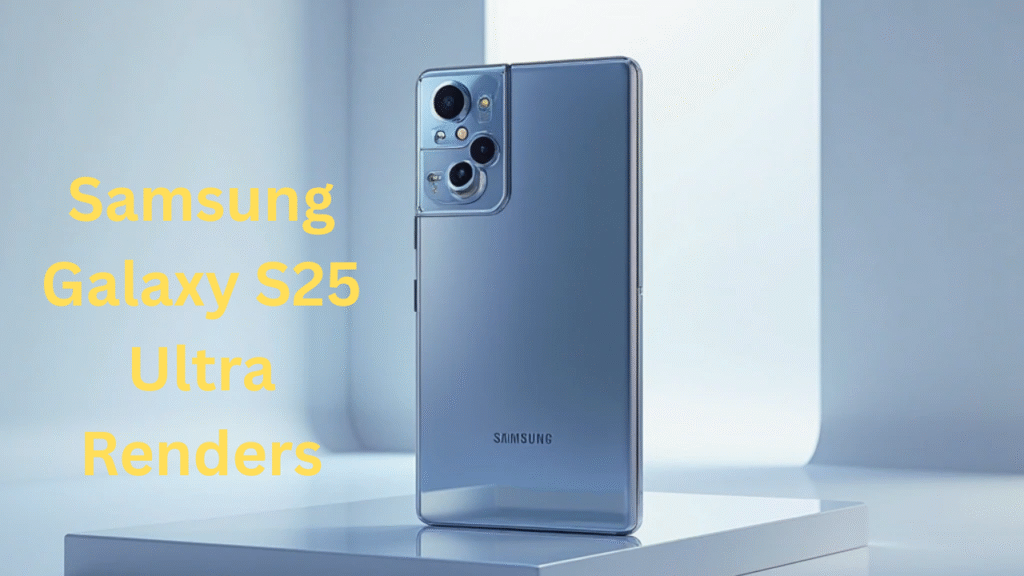
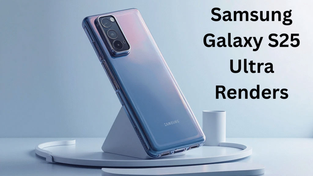
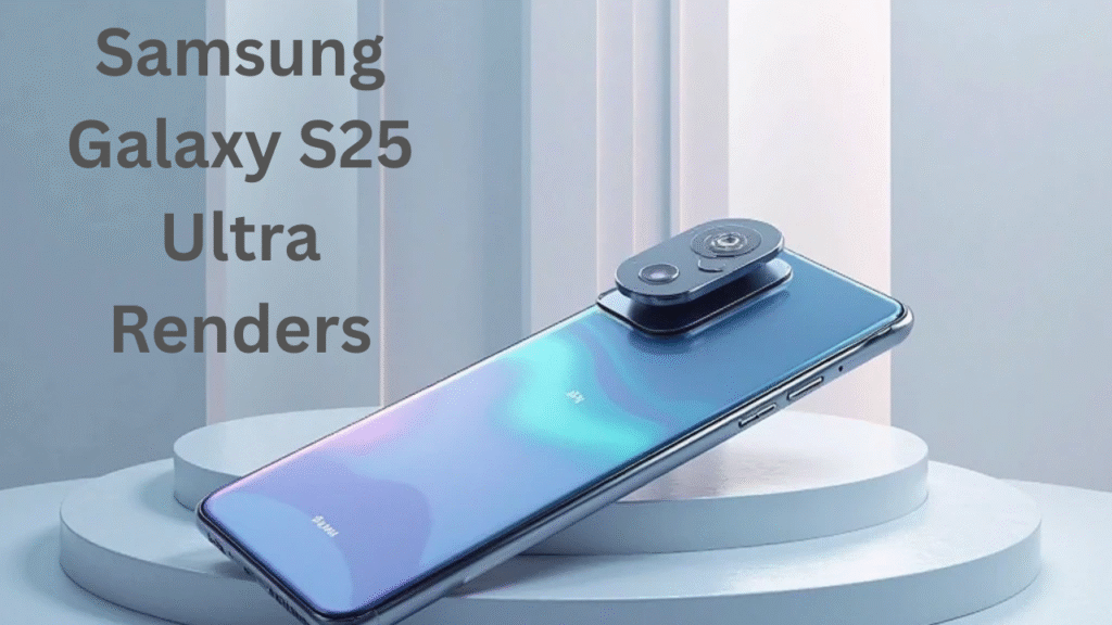
Rear Camera Design Gets a Sleek Makeover
There has also been an important modification to the device’s back. Bid goodbye to the large camera bump. Based on the renders of the Samsung Galaxy S25 Ultra, the cameras will now be flush with the back panel, giving the device a more attractive, more premium appearance.
The change goes beyond appearance. Users have been begging for a flush camera since it may mean more durability and fewer accidental scratches. But it also brings up problems with sensor limitations and thermal throttling.
Power Word: Elegant
Positive Word: Durable
Negative Word: Limiting (if it affects performance)
A More Integrated and Ergonomic S-Pen
The lovers of stylus have not been forgotten. According to the renders of the Galaxy S25 Ultra, the S-Pen is now more fully integrated into the phone’s body. The docked location looks more intuitive, ergonomic, and less bulky.
Although this may seem like an insignificant change, power users who depend on the S-Pen for everything from creativity to productivity are going to like this improvement.
- Power Word: Intuitive
- Positive Word: Ergonomic
- Negative Word: Clunky (in older models)
Performance Clues Hinted at by Samsung Galaxy S25 Ultra Renders
While Samsung Galaxy S25 Ultra renders primarily highlight design, they also quietly reveal performance hints. The improved heat dissipation vents and larger surface area around the camera module suggest better thermal management—ideal for gaming and heavy multitasking.
The sleeker rear housing could indicate an enhanced internal layout, possibly accommodating a next-gen Snapdragon processor or Exynos variant. These hardware refinements might bring efficiency boosts and faster AI-assisted photo processing.
Even the placement of microphones and antenna bands suggests optimized 5G performance and better call clarity. The cleaner design could also support improved speaker output or a larger battery module inside.
When examined closely, the renders tell a story of balance—powerful internals wrapped in a minimalist, premium shell. It’s a clear sign that Samsung isn’t just chasing looks but also pushing performance boundaries through smarter design integration.
Although the main objective of renders is aesthetics, skilled observers can also extract performance insights from them. Subtle but interesting hints about possible internal improvements can be observed in the Samsung Galaxy S25 Ultra renderings.
Bigger Vents May Signal a Beast Under the Hood
Certain members of the community like flat screens for gaming precision and productivity, while many delight over the return of curves. Although the curved display on the Galaxy S25 Ultra renders amazing images, some analysts may deem it a step backward.
Power Word: Beastly
Positive Word: Improved
Negative Word: Overheating
Flat Display Fans Might Be Disappointed
While many celebrate the return of curves, others in the community prefer flat screens for productivity and gaming precision. The Galaxy S25 Ultra renders clearly show a curved display, which, while beautiful, may be seen as a step back for some professionals.
- Power Word: Immersive
- Positive Word: Polished
- Negative Word: Impractical (for stylus work)
Samsung Galaxy S25 Ultra Renders vs S24 Ultra: A Visual Evolution
Comparing Samsung Galaxy S25 Ultra renders with the S24 Ultra reveals Samsung’s steady evolution in design philosophy. While both models share a familiar DNA, the S25 Ultra feels more refined and modern.
The sharper edges are slightly softened, the camera module sits more flush with the body, and the bezels look almost invisible—giving it a sleeker, edge-to-edge display appeal. It’s less industrial, more artistic.
Samsung seems to be focusing on ergonomics this time, offering a more comfortable grip and reduced visual bulk. The S Pen integration remains iconic but better concealed within the body.
Overall, the S25 Ultra appears more unified—every curve, cut, and corner feels intentional. It’s a visual upgrade that doesn’t scream for attention but wins it effortlessly. Samsung’s approach here proves that innovation sometimes means refinement, not reinvention.
Comparing the Samsung Galaxy S25 Ultra renders with last year’s S24 Ultra models reveals several design improvements—but also raises a few eyebrows.
- Bezels: Significantly thinner on the S25 Ultra.
- Cameras: Streamlined layout vs. the staggered look of the S24 Ultra.
- Build: Possible titanium frame instead of aluminum, offering better durability.
- S-Pen: Better dock placement and reduced lag expected.
However, skeptics argue that many of these enhancements feel iterative rather than revolutionary, especially if the internal hardware remains mostly the same.
Pros and Cons of Samsung Galaxy S25 Ultra Renders
The Samsung Galaxy S25 Ultra renders offer an exciting glimpse at what could be Samsung’s most polished flagship yet. But as always, early visuals come with their pros and cons.
On the plus side, the design looks incredibly premium—sleeker edges, balanced proportions, and near-perfect symmetry. The renders also suggest improved durability and possibly lighter materials, making it more comfortable for everyday use.
However, some fans argue that the overall look remains too similar to previous Ultras, lacking bold innovation. The flat design might also divide opinions among curved-screen enthusiasts.
Still, the renders project confidence in Samsung’s design direction—refinement over radical change. If the final device delivers what the visuals promise, it could become one of 2025’s best-looking and most practical smartphones.
| Pros | Cons |
|---|---|
| Stunning bezel-less display for immersive viewing | Curved screen may reduce usability for some users |
| Elegant, flush camera design enhances aesthetics | Camera performance still unconfirmed |
| Improved S-Pen integration boosts productivity | Renders are unofficial—design may change |
| Bigger vents hint at better thermal management | Could signal higher power consumption |
| A possible titanium frame adds durability | Might increase weight and price |
Final Verdict: Should We Get Excited About the Samsung Galaxy S25 Ultra Renders?
Not only do the renders of the Samsung Galaxy S25 Ultra look fascinating, but they are also inspiring. Some of the enhancements seem to be growing, but others show that Samsung is paying heed to what consumers have to say. With its advanced camera module and bold display choices, this Ultra could be the one to finally achieve a balance between performance and style.
Yes, there are questions. Will it get overly hot? Will it be overpriced? Do these depictions match the real thing at all? But for the time being, these images communicate a powerful message: hope. Hope that the S25 Ultra won’t just follow trends—it could set them.
👉 Bookmark this page and check back regularly for real-time updates as we inch closer to Samsung’s big reveal.
👉 And don’t forget to explore our in-depth comparisons on other Galaxy devices via this [https://techiemobiles.com/].
Frequently Asked Questions (FAQs)
Q1: Are the Samsung Galaxy S25 Ultra renders accurate?
The Samsung Galaxy S25 Ultra renders are based on early leaks and industry speculation. While they’re not official, they often come from trusted sources in the tech space.
Q2: What do the Galaxy S25 Ultra renders reveal about performance?
Though purely visual, the Samsung Galaxy S25 Ultra renders hint at larger cooling vents and better stylus integration—signs of improved performance and usability.
H3: Will the S25 Ultra have a titanium frame?
Some Samsung Galaxy S25 Ultra renders suggest the use of a titanium frame, though this hasn’t been confirmed by Samsung. If true, it could mean greater durability and a premium feel.
Q3: Are there any major design changes?
Yes, the Samsung Galaxy S25 Ultra renders show significant design upgrades—such as ultra-thin bezels, a flush camera array, and a more integrated S-Pen.
Q4: When is the Samsung Galaxy S25 Ultra expected to launch?
Based on Samsung’s typical schedule, the S25 Ultra may launch in Q1 2026. However, as the Samsung Galaxy S25 Ultra renders are still unofficial, nothing is set in stone.
2 thoughts on “Samsung Galaxy S25 Ultra Renders: First Look at Samsung’s Boldest Flagship Yet”
Comments are closed.