Imagine standing in a crowded café where every device looks the same—cold, metallic, and predictable. Then, across the room, a phone catches the light differently. It isn’t louder or more advanced than the rest, yet it feels alive, almost like it carries a heartbeat of its own. That’s the quiet power of color: it shifts perception, it sparks memory, and it makes something ordinary unforgettable.
The rise of the iPhone pink has been less about a shade and more about what that shade unlocks. It speaks to those moments when technology stops being just a tool and becomes an extension of mood, identity, and even confidence. Some see it as playful; others feel it’s bold. For a few, it’s nostalgic—echoing the glow of old Polaroids or the warmth of sunsets that never left the mind.
What makes this particular version of Apple’s design so magnetic isn’t simply its aesthetic appeal—it’s the way it dares to be different in a sea of sameness. It asks an unspoken question: if a device you hold every day can reflect something deeper about you, why settle for anything less?
This isn’t just about color. It’s about the quiet revolution of choosing beauty, individuality, and subtle defiance—right there in the palm of your hand.
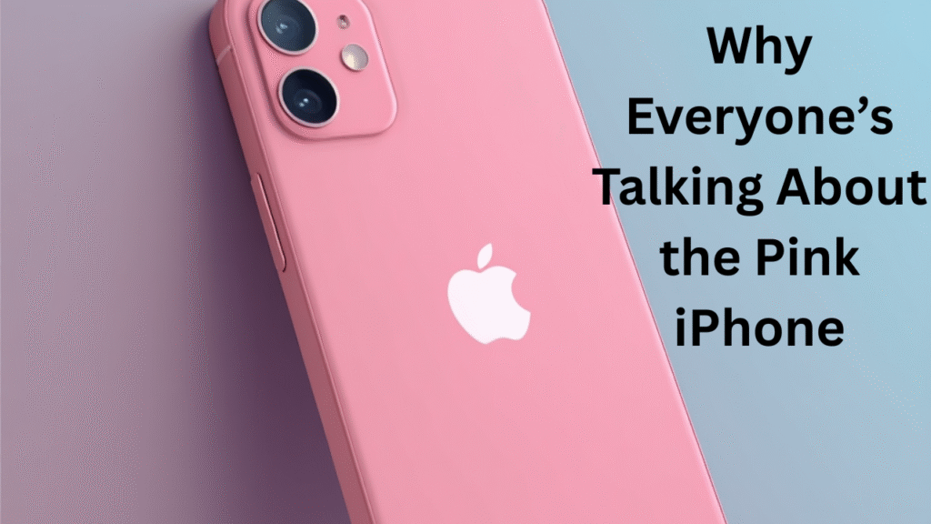
Introduction—Why Color Still Matters in Technology
Technology often hides behind the mask of minimalism—sleek, metallic, and serious. But color has the power to shift perception, to remind us that even the most advanced device can carry personality. The arrival of iPhone pink proved that a smartphone isn’t just a tool; it’s an emotional extension of who we are. In a world where design choices are often practical, a soft but striking shade can transform something ordinary into something memorable. Color doesn’t just decorate; it speaks, influences moods, and even defines the way we interact with the objects we use daily.
Emotional and psychological impact of color in everyday devices
The subtle presence of color in devices can create a strong emotional response. Pink tones, in particular, often evoke calmness, nostalgia, or even confidence. With iPhone pink, Apple isn’t merely offering a variant—it’s shaping an experience. That single shade can shift how users feel about their phone, making it less like a machine and more like a companion. It’s a reminder that even the smallest detail can trigger joy in everyday use.
The rising trend of personalization through tech design
Personalization in technology has moved beyond wallpapers and cases. Consumers now want the device itself to represent individuality, and iPhone pink delivers that freedom. Choosing this model is not about following a trend but about carving a personal identity through design. It reflects how tech has evolved from being purely functional to becoming a lifestyle statement.
The Story Behind iPhone Pink
Apple has always treated color as more than surface decoration. When the pink finish was introduced, it marked a shift in how the company understood its users. The decision wasn’t accidental—it aligned with cultural movements favoring softness, warmth, and individuality. iPhone pink wasn’t just a shade; it was a design statement woven into Apple’s long tradition of blending emotion with engineering.
Apple’s design philosophy and why this color choice became iconic
Apple’s designers focus on subtlety and impact, and pink fit seamlessly into that vision. Unlike bold neons or loud finishes, iPhone pink balanced elegance with charm. Its popularity was instant because it wasn’t overbearing but memorable—a color that carried sophistication while offering playful undertones. That harmony between refinement and expression is what made it iconic.
Subtle shifts in consumer demand for softer, more personal tones
Market trends revealed that consumers craved technology that felt more personal, less sterile. iPhone pink met that demand, offering a softer alternative to metallic grays and blacks. It reflected a cultural desire for warmth in the cold world of technology, and Apple tapped into that shift with perfect timing.
iPhone Pink in Pop Culture & Fashion Influence
When tech intersects with culture, it often sparks movements bigger than itself. iPhone pink didn’t remain just a gadget—it became an accessory of self-expression. Seen in the hands of celebrities, influencers, and fashion-forward professionals, it blurred the line between technology and lifestyle.
How celebrities, influencers, and lifestyle trends boosted its popularity
High-profile names flashing iPhone pink in candid moments fueled desire for the device. The association between trendsetters and this color elevated it beyond functionality—it became aspirational. For fans, owning this variant wasn’t about specs but about being part of a cultural wave.
The crossover between fashion accessories and phone aesthetics
Phones are no longer hidden away; they’re showcased alongside watches, handbags, and sneakers. iPhone pink naturally complements modern fashion palettes, from minimal streetwear to luxury couture. It’s less about the phone fitting into your outfit and more about it enhancing your style.
Who Is the Pink iPhone Really For?
The answer is simple: everyone who wants a phone that feels personal. Stereotypes once tied pink to a single demographic, but iPhone pink shattered those assumptions. It proved that color doesn’t belong to gender—it belongs to personality.
Breaking stereotypes: not just for one gender or style
Apple’s choice to release a pink model wasn’t about targeting a niche—it was about inclusivity. From creative professionals to tech enthusiasts, users embraced the color as a symbol of individuality. It challenged outdated ideas about who “should” own pink.
Why this color appeals to professionals, minimalists, and trendsetters alike
Minimalists admire the understated elegance, professionals see it as a refined twist on classic design, and trendsetters view it as a bold statement. iPhone pink carries enough versatility to resonate across lifestyles without losing its uniqueness.
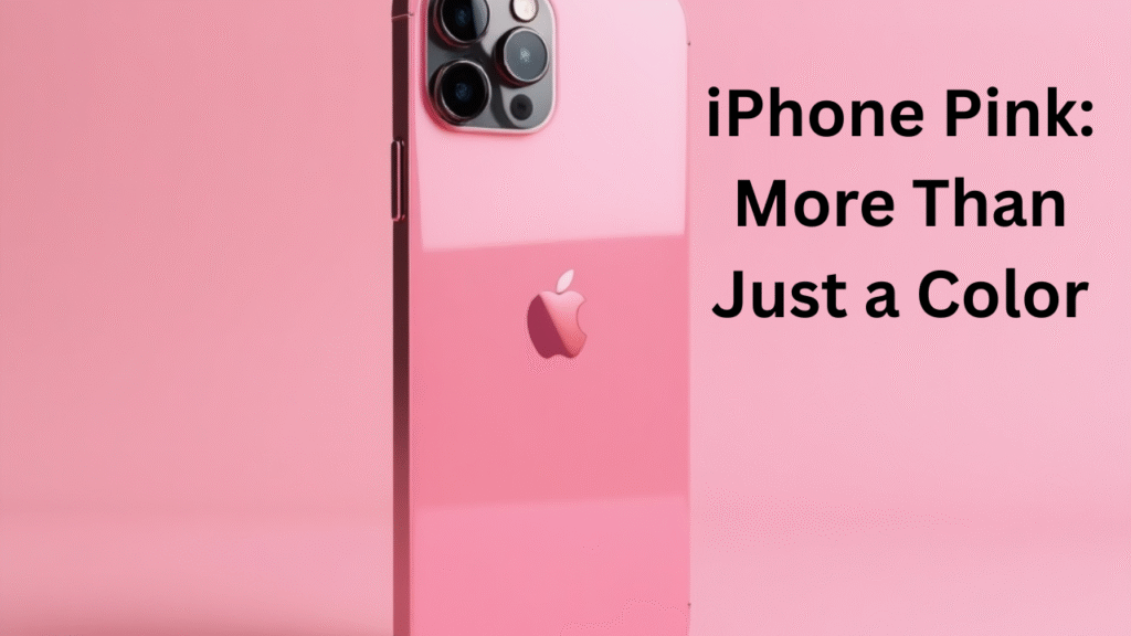
Design & Feel: More Than Just a Color
Apple’s craftsmanship ensures that pink isn’t just painted on—it’s part of the device’s character. The anodized aluminum and glass finish give the shade depth, making it shimmer differently under light. This attention to detail makes iPhone pink feel alive, not flat.
How the finish, texture, and material amplify the pink shade
The way Apple fuses material with color creates an almost liquid smoothness. The pink isn’t loud—it shifts gently depending on lighting, offering a dynamic feel. That tactile harmony elevates it beyond “just another option.”
Comparing iPhone pink to other Apple finishes (e.g., gold, blue, and graphite)
Gold leans luxurious, blue feels bold, graphite stands classic—but pink offers a subtler emotional resonance. It bridges the gap between playful and professional, making it one of Apple’s most versatile finishes to date.
Emotional Connection: Why Users Love It
For many, choosing iPhone pink isn’t a casual decision—it’s an emotional one. A device held hundreds of times a day becomes part of someone’s story, and pink adds warmth to that relationship.
Stories and testimonials of users choosing pink as a statement of individuality
Users often share that they picked iPhone pink because it “felt right.” Some describe it as nostalgic, others as empowering. In each case, the choice reflects something deeply personal rather than purely aesthetic.
How color creates personal attachment to technology
The shade creates a sense of ownership that standard finishes rarely achieve. By making technology feel more human, iPhone pink strengthens the bond between user and device, turning everyday use into a small act of joy.
Best Accessories for iPhone Pink
The right accessories amplify the device’s personality. From cases to wallpapers, every detail can enhance the pink finish and create a seamless aesthetic.
Cases, wallpapers, and matching tech gear to amplify the aesthetic
Clear cases highlight the original shade, while pastel-colored ones extend its charm. Wallpapers designed around pink gradients add harmony, and matching gear like AirPods cases or watch bands complete the look.
Curated style suggestions for different personalities
For professionals, muted leather accessories pair beautifully with pink. Minimalists often stick with transparent cases, while creatives embrace bold contrasts—neon greens, metallic silvers, or patterned designs that make the color pop even more.
Comparison: iPhone Pink vs. Other Trending Colors
Every Apple color carries its own personality, but pink stands apart because it balances emotion with timelessness.
Which color holds the strongest resale value and consumer demand?
Historically, lighter shades like pink have held strong resale appeal, especially in limited runs. Collectors and everyday users alike recognize the uniqueness of the finish, keeping demand consistent.
The psychology of choosing between bold, classic, or soft tones
Choosing graphite or silver suggests reliability, while blue leans adventurous. Pink falls in between—a confident yet approachable choice, ideal for users who want subtle distinction without overwhelming attention.
Future of iPhone Colors—What’s Next After Pink?
Apple is unlikely to stop experimenting with finishes, and trends suggest an appetite for even more expressive designs.
Predictions for upcoming Apple color trends
Muted greens, deeper metallic purples, and even gradient finishes could be next. Apple may push boundaries to meet consumer desire for devices that feel personal and rare.
How consumer behavior may push for even bolder or more unique shades
The success of iPhone pink shows that users value individuality in their tech. Future models may lean on bold tones or even customizable finishes, reflecting a culture that demands self-expression at every level.
✅ Pros & Cons of iPhone Pink
| Pros | Cons |
|---|---|
| Unique and stylish color that stands out | Limited availability compared to standard colors |
| Appeals to multiple lifestyles and personalities | May not suit users who prefer darker tones |
| Strong resale value due to demand | Fingerprints may show more on glossy finishes |
| Complements accessories and fashion trends | Popularity can make it harder to find in stock |
❓ FAQ: iPhone Pink
Is the iPhone pink available in all models?
Not every generation offers a pink finish, but it appears in select models where Apple introduces new design palettes.
Does iPhone pink scratch or fade over time?
Apple’s anodized aluminum and glass coating are designed to protect the finish, keeping the shade durable with normal use.
Is iPhone pink more expensive than other colors?
No, the price remains the same across color variants, though resale value can be higher due to demand.
Who is iPhone pink best suited for?
It’s versatile—appealing to professionals, creatives, minimalists, and anyone seeking a stylish yet subtle option.
Final Thoughts—More Than a Phone, A Personal Expression
The iPhone has always been more than hardware, but the pink variant crystallized this idea. It gave users a way to hold something deeply personal in their hands without sacrificing elegance. iPhone pink isn’t simply a color—it’s proof that technology can carry emotion. And as Apple continues evolving its palette, this shade will remain a timeless reminder that design is just as powerful as innovation.
1 thought on “iPhone Pink: When Technology Starts to Feel Like Emotion”
Comments are closed.